Short Praise for Grammar of Graphics
“Once we understand that a pie is a divided bar in polar coordinates, we can construct other polar graphics that are less well known. We will also come to realize why a histogram is not a bar chart…” – Leland Wilkinson, The Grammar of Graphics, Second Edition
“No human should ever write plotting code again, an LLM can do it”
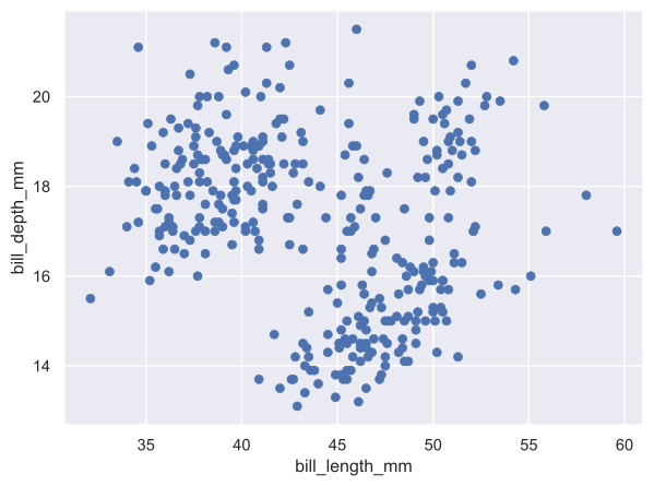
The second quote is from (an unnamed) professor of mine, probably expressing frustration at hard-to-remember syntax for plotting in most languages. Nevertheless, I claim that you should study the logic behind graphs. This logic helps organize what is possible, and the core ideas are fairly brief. This logic—and even some of the syntax from the first implementation (ggplot)—has infected most modern graphic libraries. Take python’s seaborn:
import seaborn.objects as so
from seaborn import load_dataset

penguins = load_dataset("penguins")

plot = (
    so.Plot(penguins, x="bill_length_mm", y="bill_depth_mm")
      .add(so.Dot())                              # geometry layer
)

plot.save("build/export-1.svg", bbox_inches="tight")
import seaborn.objects as so
from seaborn import load_dataset

penguins = load_dataset("penguins")

plot = (
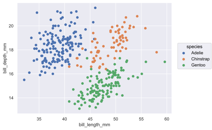
    so.Plot(penguins, x="bill_length_mm", y="bill_depth_mm", color="species")
      .add(so.Dot())                              # geometry layer
)

plot.save("build/export-2.svg", bbox_inches="tight")
import seaborn.objects as so
from seaborn import load_dataset

penguins = load_dataset("penguins")

plot = (
    so.Plot(penguins, x="bill_length_mm", y="bill_depth_mm", color="species")
      .add(so.Dot())                              # geometry layer
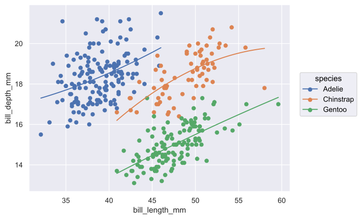
      .add(so.Line(), so.PolyFit())               # statistics & geometry layer
)

plot.save("build/export-3.svg", bbox_inches="tight")
import seaborn.objects as so
from seaborn import load_dataset

penguins = load_dataset("penguins")

plot = (
    so.Plot(penguins, x="bill_length_mm", y="bill_depth_mm", color="species")
      .add(so.Dot())                              # geometry layer
      .add(so.Line(), so.PolyFit())               # statistics & geometry layer
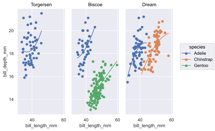
      .facet(col="island")                        # faceting
)

plot.save("build/export-4.svg", bbox_inches="tight")
import seaborn.objects as so
from seaborn import load_dataset

penguins = load_dataset("penguins")

plot = (
    so.Plot(penguins, x="bill_length_mm", y="bill_depth_mm", color="species")
      .add(so.Dot())                              # geometry layer
      .add(so.Line(), so.PolyFit())               # statistics & geometry layer
      .facet(col="island")                        # faceting
      .scale(color="hls")                         # scale
)

plot.save("build/export-5.svg", bbox_inches="tight")
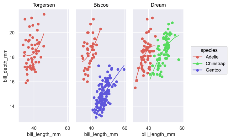
import seaborn.objects as so
from seaborn import load_dataset

penguins = load_dataset("penguins")

plot = (
    so.Plot(penguins, x="bill_length_mm", y="bill_depth_mm", color="species")
      .add(so.Dot())                              # geometry layer
      .add(so.Line(), so.PolyFit())               # statistics & geometry layer
      .facet(col="island")                        # faceting
      .scale(color="hls")                         # scale
      .label(x="Bill length (mm)", y="Bill depth (mm)")
)

plot.save("build/export-6.svg", bbox_inches="tight")
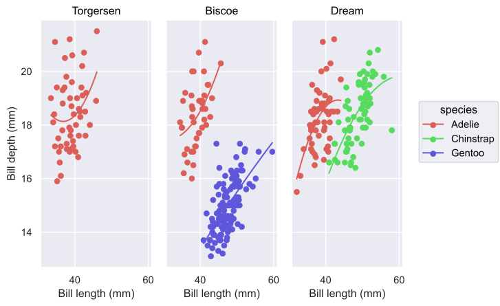
Here is how you should interpret the above:
- A mapping from
row -> (x, y)orrow -> (x, y, color) - Some geometry layers which map points in
(x, y, color)into, well, geometry on the canvas, such as points, line segments, bars, etc - A layer controlling faceting, or partitioning data points into multiple graphs. You can even facet rows separately from columns to display two different dimensions
- Some layers adding statistical aggregations, such as mean w/ confidence intervals, lines of best fit, etc
- Some layers controlling scales
- Either on some continuous space, remapping of
ℝ -> ℝ. Perhaps transforming bylog10to make the y-axis a log scale, or by \(\sqrt x\) to make the area of symbols proportional to the measured quantity, rather than their radius. - Or mapping a column to a discrete set, such as a set of color, shape, line types, etc
- Either on some continuous space, remapping of
- Some layers concerning theming and labeling such as setting background colors, axis formatting, text font and size, as well as labeling axes and the graph as a whole
In short, a composable and unfussy bag-of-tricks to display medium-dimensional data1 on a 2D canvas. A few more modern ideas to extend this framework:
- Interactive charts with sliders, buttons, etc
- 3D renders
- Video, in which time is used as a dimension
Mathematica (rest in peace) was wonderful at this. You could wrap nearly anything in Manipulate and get an interactive graphic with a “Play” button.
The power of this framework is not the originality of its design but the expressive depth of its few rules. Viewing 4 to 7 dimensions of your dataset in a single image from ~5 lines of code should be taken for granted by more people.
Footnotes:
also known as “Grande data” in the Starbucks Ontology of Data Size™